Can't see the region you're looking for? You can find a list of our global locations here
When it comes to designing schools and hospitals, there are a lot of factors to consider. Comfort, safety, and functionality are all critical elements, but one factor that often goes overlooked is the use of colour. Colour is a powerful tool that can significantly impact our mood and well-being, and it's important to consider this when designing these spaces.
Altro Suprema is a premium safety flooring solution that not only provides exceptional slip resistance, durability, and cleanability but also offers a wide range of vibrant colours that can add a touch of creativity and personality to any school or hospital environment.
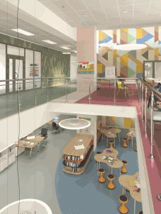 In schools, colour can play a critical role in creating a positive and stimulating learning environment. Bright and bold colours can help to promote creativity and enhance focus, while softer colours can create a calm and peaceful atmosphere. However, it's important to strike a balance between stimulating and calming colours, as too much stimulation overwhelm students.
Blue is a common colour seen in schools as it is a calming and soothing colour that can help to reduce stress and anxiety, making it an excellent choice for classrooms and study areas. It is proven that blue can improve concentration and focus, making it an ideal colour for test-taking environments.
Green is another colour that can have a positive impact on students. Green is associated with nature and can help to create a sense of tranquillity and relaxation. It's a great colour for common areas and spaces where students can take a break from studying and recharge.
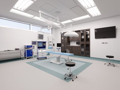 Colour can play a crucial role in promoting healing and recovery in hospitals. Calming colours like blues and greens can help to reduce anxiety and stress, while warmer colours like yellows and oranges can create a sense of comfort and warmth. Soft, neutral colours like beige and grey can create a soothing environment for patients, while brighter colours can be used to create a more cheerful atmosphere.
One colour that is often used in hospitals is pink. Pink is a calming and nurturing colour that can help to create a sense of comfort and care. It's also been shown to reduce aggression and improve communication, making it an excellent choice for patient rooms and waiting areas.
It's important to note that using colour in schools and hospitals should be done in moderation. Too much stimulation can be overwhelming, so it's important to balance calming and stimulating colours. Additionally, it's essential to consider the needs of different populations, such as children or elderly patients, and adjust the colour scheme accordingly.
When choosing the right colours for a space, it's important to consider the mood you want to create and the impact of different colours on our emotions. Altro Suprema provides the perfect solution for incorporating natural colours and elements into your designs to create a more harmonious and calming environment that promotes well-being and healing.
Click here to see Altro Suprema's 33 modern colours.