Can't see the region you're looking for? You can find a list of our global locations here
For the first time, we’ve teamed up with colour trend forecaster Laura Perryman to explore how colour influences design, well-being, and decision-making across sectors.
The result? A carefully curated framework of 10 colour groups designed to help our customers navigate the Altro product range more easily and make confident, purposeful choices.

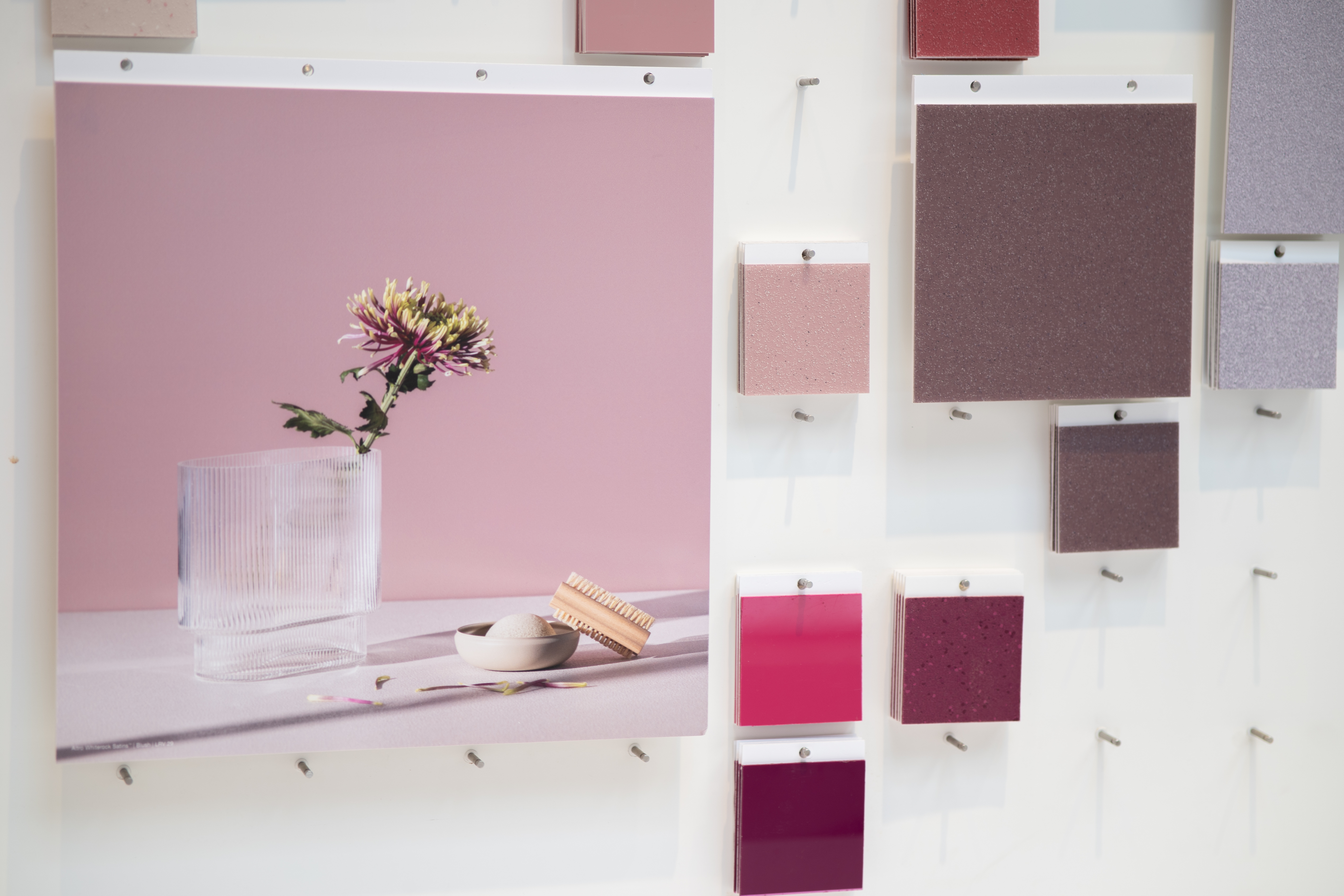
These colour families are inspired by natural palettes, cultural signals, and design psychology - helping specifiers align aesthetic goals with practical outcomes. Each group tells a different story and evokes a different emotional or spatial response. It’s about more than just colour swatches: it’s about the future of colour in real environments.
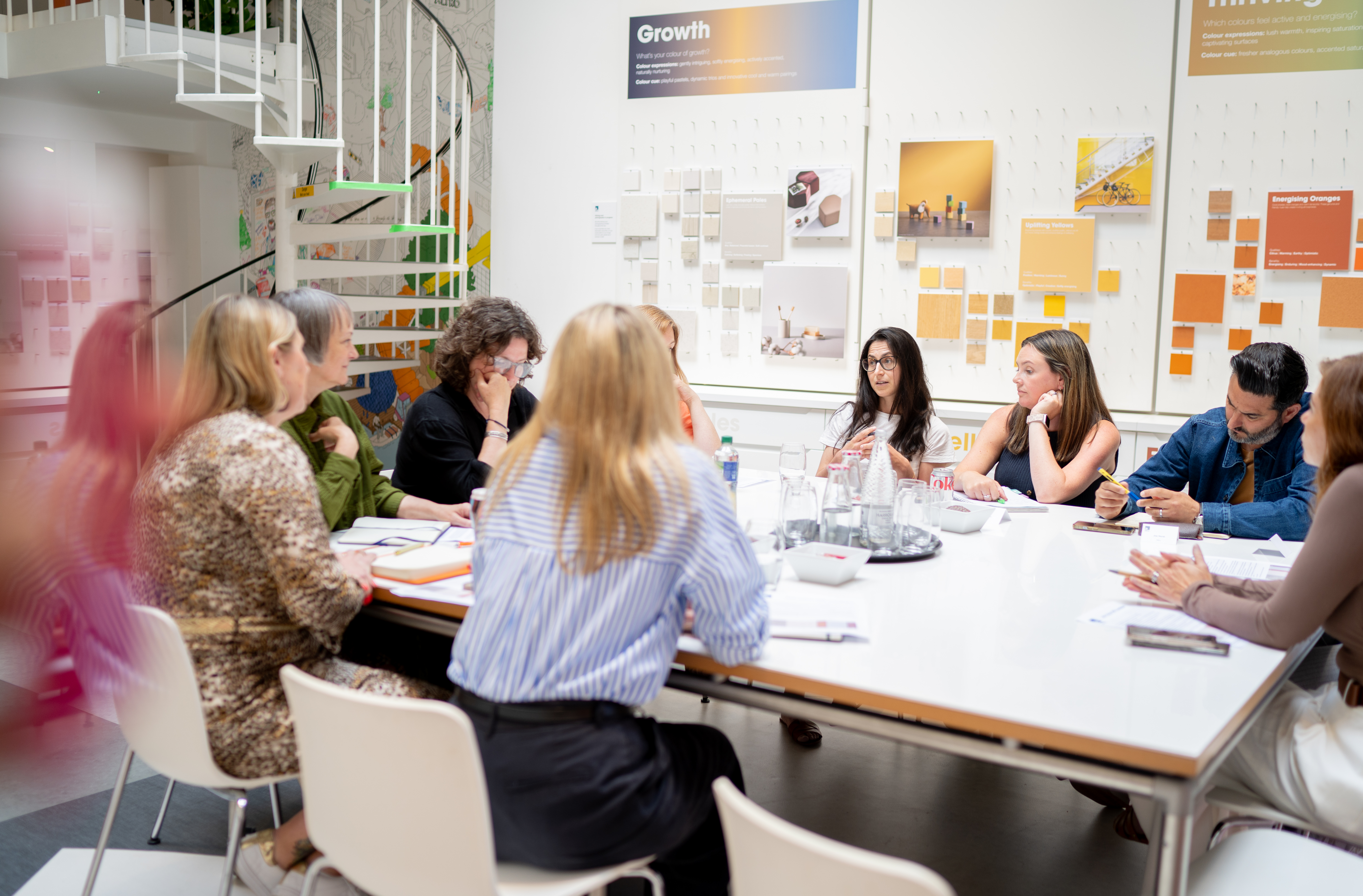
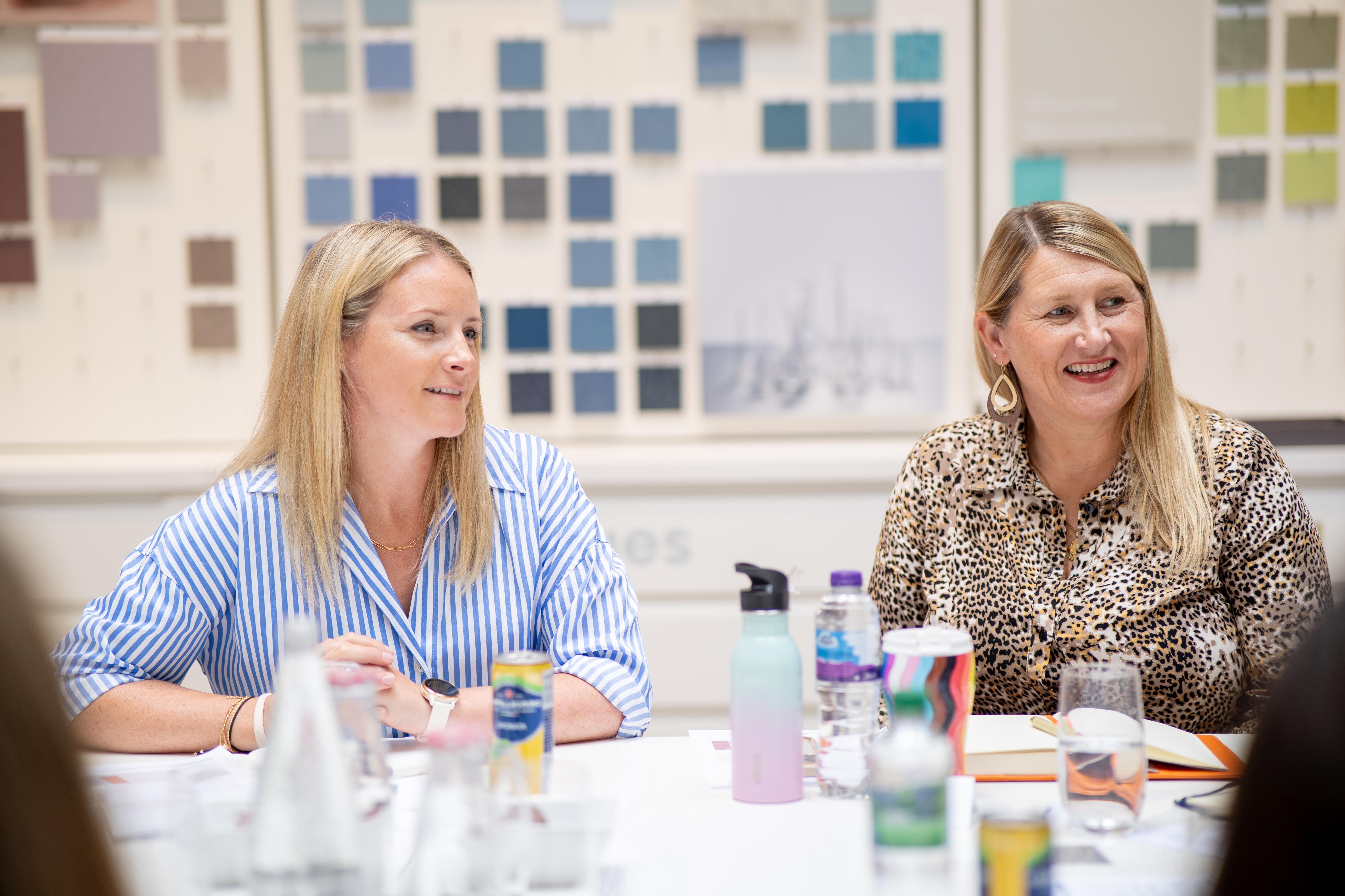
From healthcare to education, transport to interiors, colour does more than decorate. It directs, calms, empowers, and informs. At our recent roundtable event – The Psychology of Colour – held at our London showroom, we explored these themes in detail with a group of designers, product specialists and sector experts.

Here are some of the key takeaways:
- Balancing creativity with purposeful colour use
- Rethinking colour in healthcare and education settings
- Exploring cultural associations with colour
- Wayfinding, LRV values and designing for inclusivity
- How manufacturers can support braver, sustainable colour choices
From Dawn Scott, Senior Colour Designer at Dulux, who starts colour planning from the ceiling down, to Georgia Burt, architect and director of her own practice, who begins from the floor up – it was clear there’s no one-size-fits-all approach.
What unites these perspectives is the belief that colour is integral to design – not an afterthought.
One of the most thought-provoking points - and a real conversation starter - was the idea that colour choices are never “just right” on their own. Context is everything. As one contributor put it: “Colour is design – be brave.” Whether you’re creating a calming zone in a dementia ward or adding bold accents in a school, colour should always reflect the people using the space and its purpose.
Meanwhile, Stephanie Kyle, Associate Architect and Inclusive Design Consultant, highlighted the importance of consistency and confidence in education design – often starting with doors and using a restrained colour palette to reduce overstimulation.
Inspired by these insights, we’ve refreshed how we present colour at Altro. Laura Perryman worked with our design team to identify 10 key colour groups, creating visual narratives that help bring the palettes to life. These groups were featured at Clerkenwell Design Week, where visitors explored samples and discussed how they’d use (or not use) certain colours in different spaces – proof that colour is deeply subjective and highly contextual.
From ephemeral pales that open up a space, to rich grounding tones that support wayfinding and emotional clarity, our updated product colour range is built around both beauty and performance. Colour with Altro isn’t just a finish - it’s part of the solution.
Find out more about one of RIBA-approved CPDs here.

